

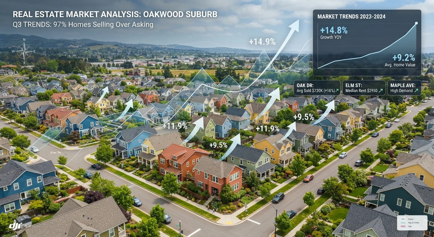
Why Most Market Headlines Don't Tell You Enough
When media outlets report on the housing market, they typically lean on national median home prices or year-over-year appreciation figures. These numbers are real, but they describe where the market has been - not where it's going. For consumers trying to make a buying, selling, or renting decision, that's the wrong direction to look.
The metrics that actually carry predictive weight operate at the local level and measure momentum - the supply-demand balance as it shifts in real time. A broader reference to key housing indicators can help orient you, but this article focuses specifically on the subset of data points with the strongest forward-looking signal.
The Four Metrics Worth Tracking
1. Months of Inventory (Absorption Rate)
Months of inventory measures how long it would take to sell all currently listed homes at the current pace of sales, assuming no new listings enter the market. Roughly six months of inventory is generally considered a balanced market. Below three months signals strong seller conditions and upward price pressure; above seven months indicates buyer leverage and often precedes price softening. See why inventory levels shape competition and pricing more than almost any other single factor.
2. Days on Market (DOM)
Days on market counts how long a listing sits before going under contract. A falling DOM across a local market - even when prices appear flat - often signals building demand ahead of visible price increases. Conversely, a rising DOM is frequently the earliest sign that buyer interest is cooling, appearing weeks before price reductions show up in aggregate data.
3. List-Price-to-Sale-Price Ratio
This ratio compares what sellers ask to what buyers actually pay. When the ratio consistently exceeds 100% - meaning homes sell above asking - it reflects competitive demand. When it slides below 97-98%, buyers are gaining negotiating room. Tracking this over consecutive months reveals directional shifts that median price data can obscure.
4. Price-to-Rent Ratio
The price-to-rent ratio divides the median home purchase price by the annual median rent for comparable properties. A high ratio (typically above 20) suggests purchasing is expensive relative to renting, which can dampen buyer demand over time and moderate appreciation. A low ratio can indicate undervalued purchase conditions - though local income levels and employment trends matter just as much.
Months of Inventory
The estimated time it would take to sell all active listings at the current sales pace if no new homes were listed. A key measure of supply-demand balance in a local market.
Days on Market (DOM)
The number of days a property is actively listed before a purchase contract is accepted. Falling DOM across a market often precedes price increases.
List-Price-to-Sale-Price Ratio
The percentage relationship between a home's final sale price and its original asking price. Ratios above 100% indicate competitive conditions where buyers are offering above asking.
Price-to-Rent Ratio
A metric comparing the cost of buying a home to the cost of renting a comparable one. Calculated by dividing median purchase price by annual median rent. Helps assess relative value between owning and renting.
Absorption Rate
The pace at which available homes are sold in a market during a given period. Often expressed as months of inventory; a high rate indicates strong demand relative to supply.
How to Use These Metrics Together
No single metric tells the complete story. The most reliable picture emerges when multiple indicators point in the same direction. For example: shrinking inventory plus a falling DOM plus a rising list-to-sale ratio together make a compelling case for continued upward price pressure. One metric moving in isolation may simply reflect seasonal patterns.
Common misreadings of housing data often stem from treating a single data point as definitive. Absorption rates are seasonal - DOM naturally rises in winter and compresses in spring - so always compare metrics to the same period in prior years, not just the previous month.
Local Data Beats National Averages
National housing statistics can mask wide variation between metros, cities, and even neighborhoods. A market that looks balanced nationally may be severely undersupplied in one ZIP code and oversupplied in another. Always source metrics - days on market, inventory, and sale ratios - for the specific area you're evaluating. Local MLS data and county assessor records are typically the most current sources available to consumers.
Macroeconomic signals - interest rates, employment growth, wage trends - feed into these local metrics rather than replacing them. Which broader economic indicators link most strongly to housing explains how to layer that context in. For foundational guidance on the home purchase process, these metrics are worth understanding before you begin your search.
3 months
Inventory level that typically signals strong seller conditions
Markets with under three months of supply have historically seen sustained upward price pressure, per National Association of Realtors analysis.
20+
Price-to-rent ratio signaling expensive buying conditions
A ratio above 20 suggests home prices are high relative to local rents, a dynamic that can moderate buyer demand over time.
The content on this site is for informational purposes only and is not a substitute for professional advice. Always consult a qualified professional for guidance specific to your situation.